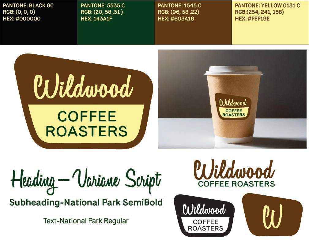

CONCEPT BRIEF:
Wildwood Coffee Roasters is a fictional brand created by ChatGPT for a Digital Media II course that I'm currently enrolled in. This project required us to create a logo, typeface, color palette, and mockups for a brand. Branding is essential in establishing consumer trust and a firmer brand personality. This company is a nature-themed coffee shop. They use ethically and naturally sourced ingredients and intend to create an atmosphere that encourages consumers not only to drink their coffee but also to appreciate nature and take care of it. Thus, their target audience is nature-lovers, but anyone else who is willing to slow down and enjoy the earth around them. This project aimed to encompass that mission and inspire consumers to think about nature.

POTENTIAL CHALLENGES:
Upon starting this project, I was fairly new to using Illustrator. Another challenge I was anticipating was finding the correct fonts to capture the brand's identity. I hoped that this project would help me grow in my design abilities, especially in Adobe Illustrator.

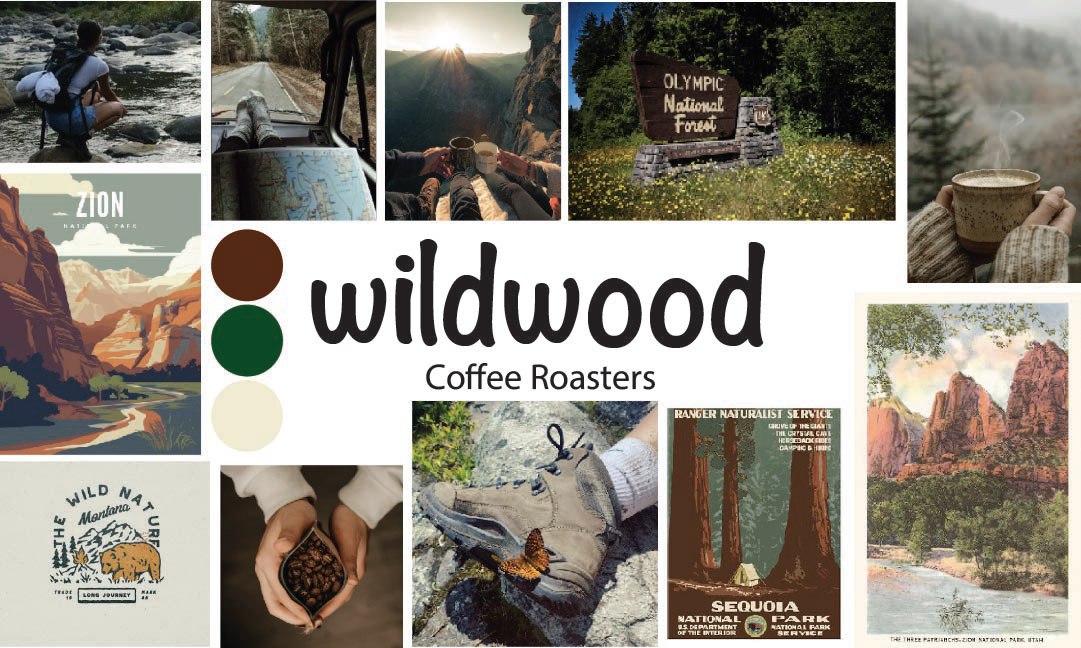
MOOD BOARD:
The first step in this process was to design a mood board to get a feel for what direction I would go with this project. If I were designing for a real-life client, I would send them the project brief along with the mood board to see if they agree with the aesthetic choices.

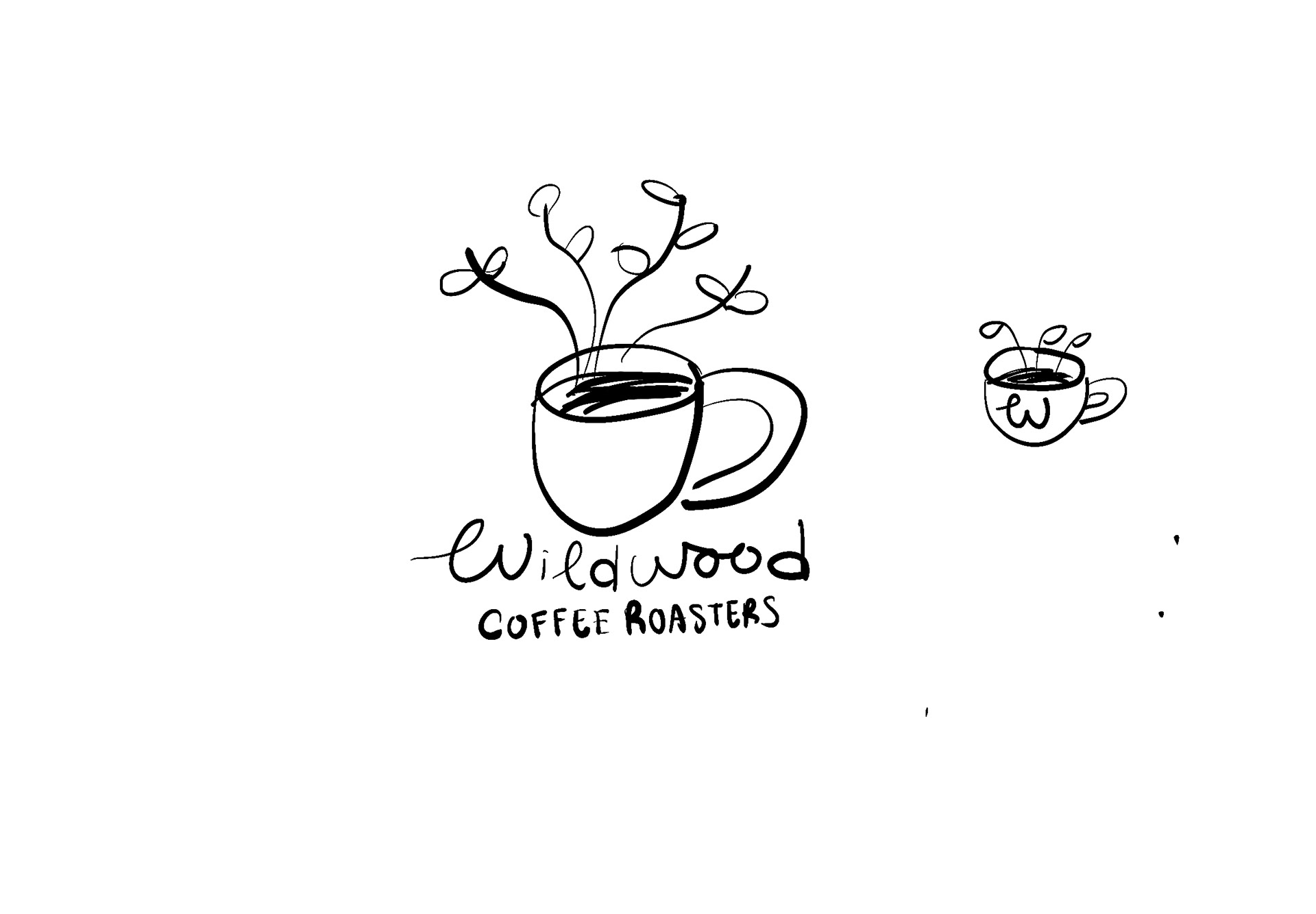
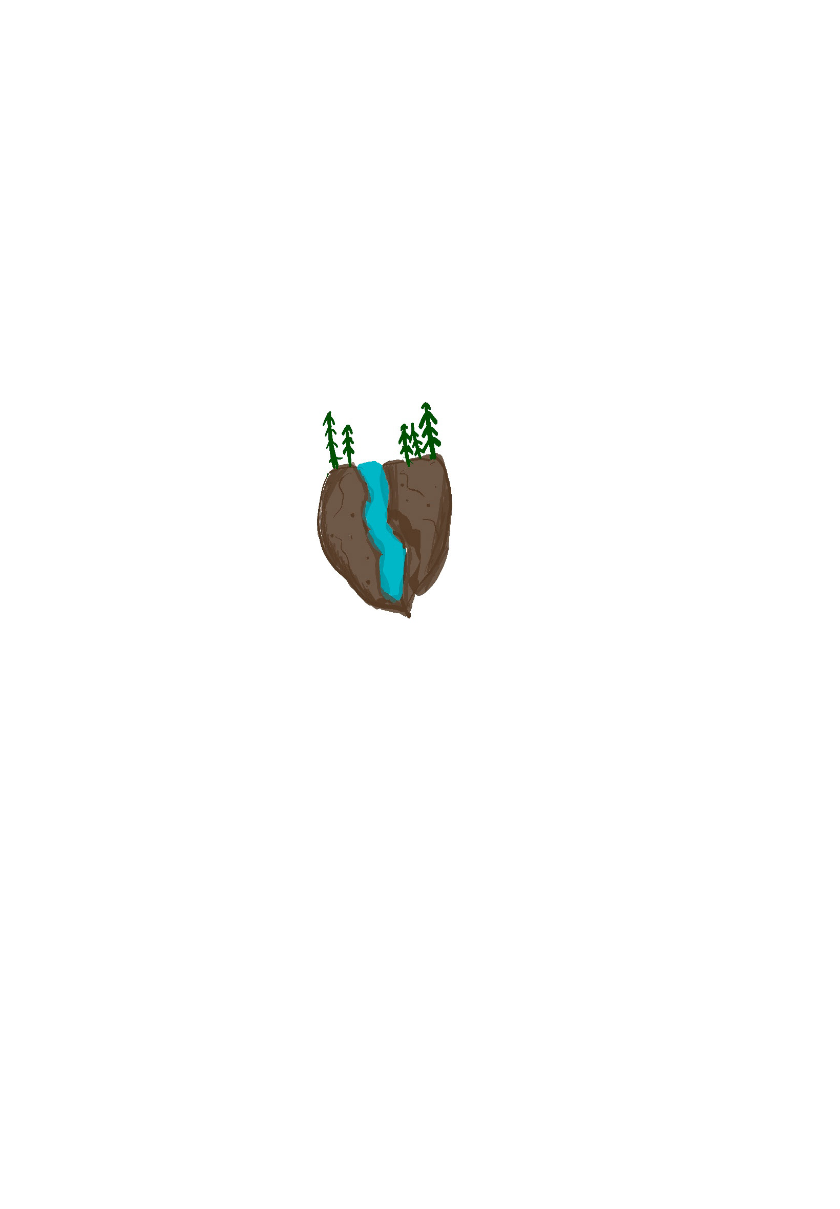
SKETCHES:
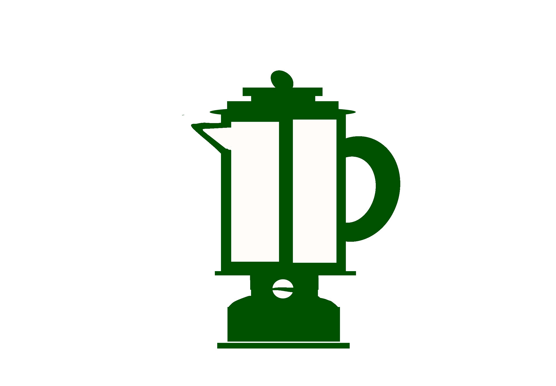
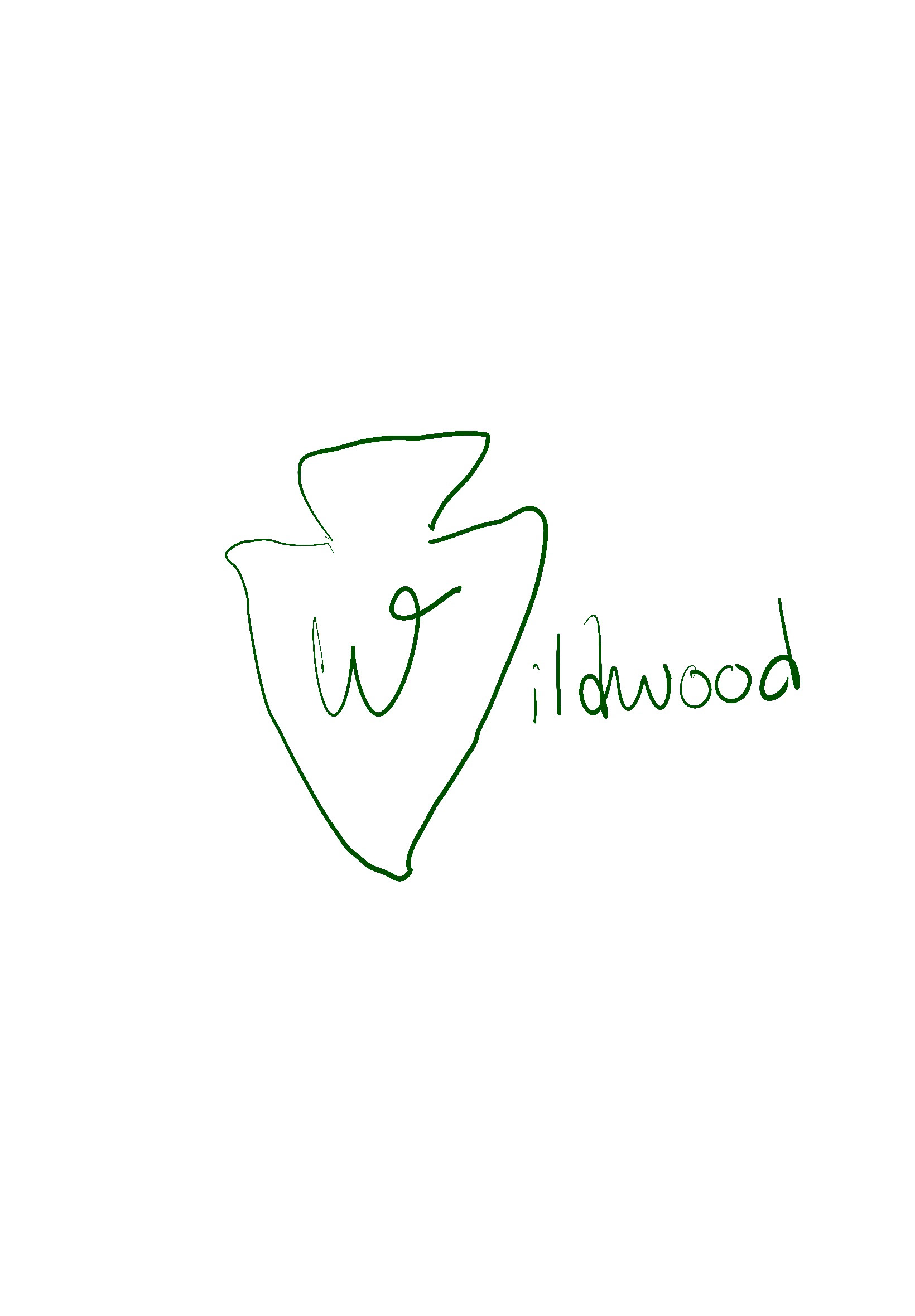
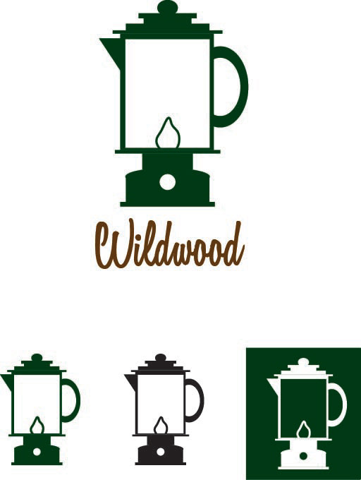
The following images were some (very) rough sketches that I did in trying to decide a direction to go for this project. My first idea was a tree growing out of a coffee mug, but a coffee mug seemed too obvious and the idea was a bit too illustrated for a simple logo icon. I really leaned into using national parks imagery. I also had a really unique idea for a lantern/percolator hybrid icon.
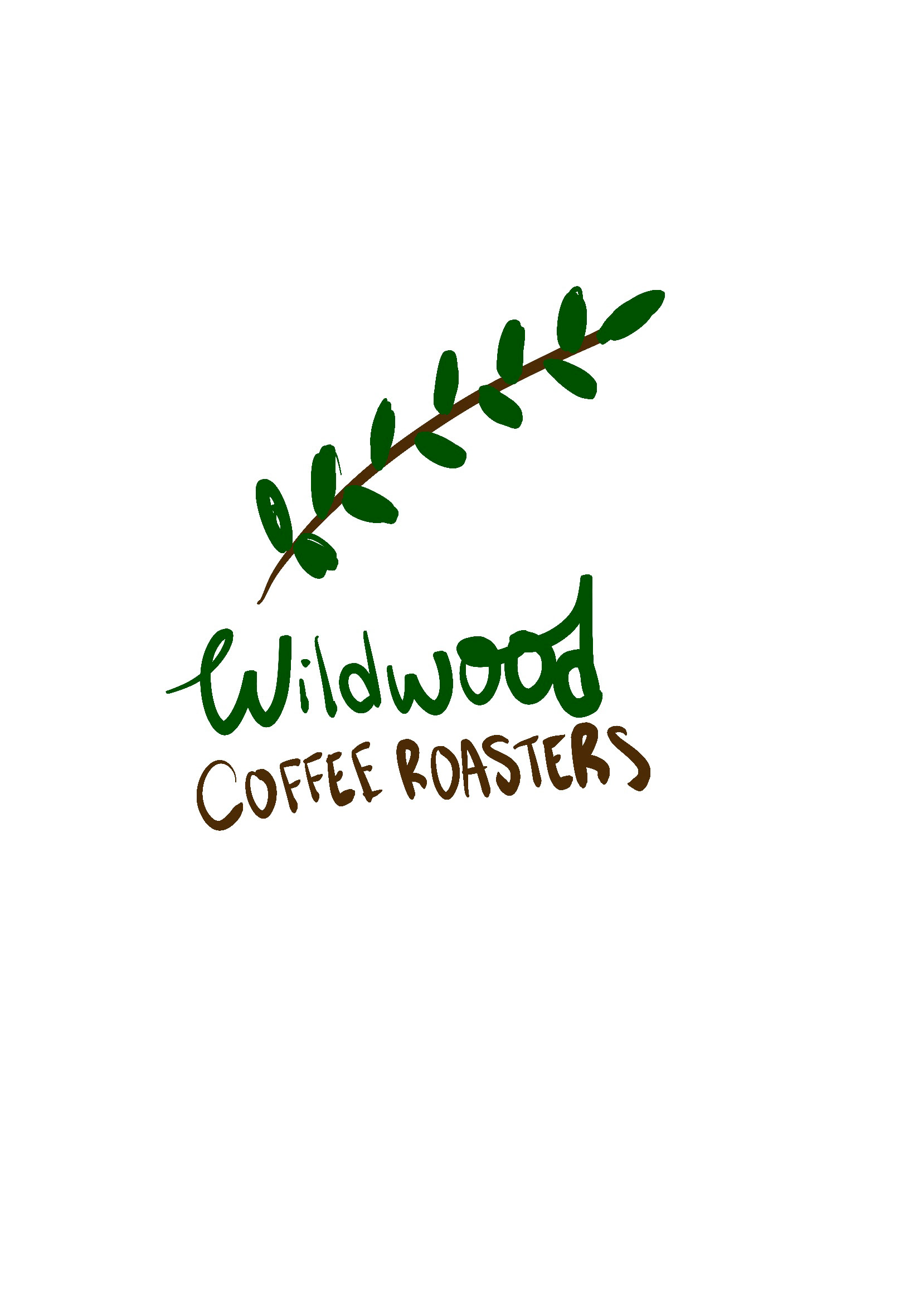
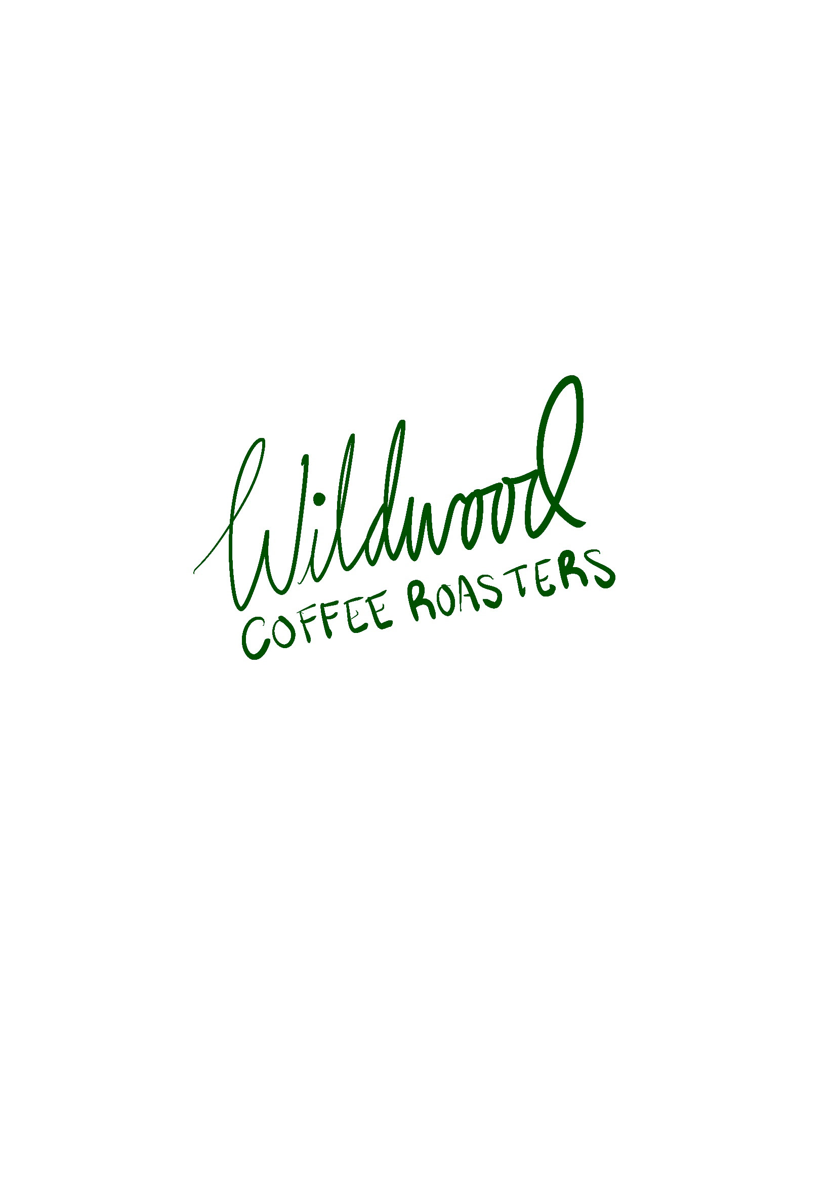

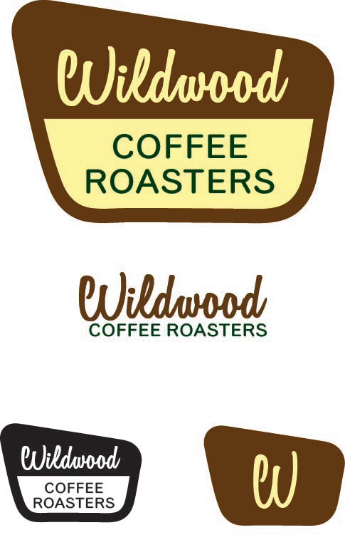
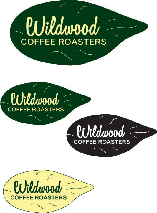
DRAFTS:
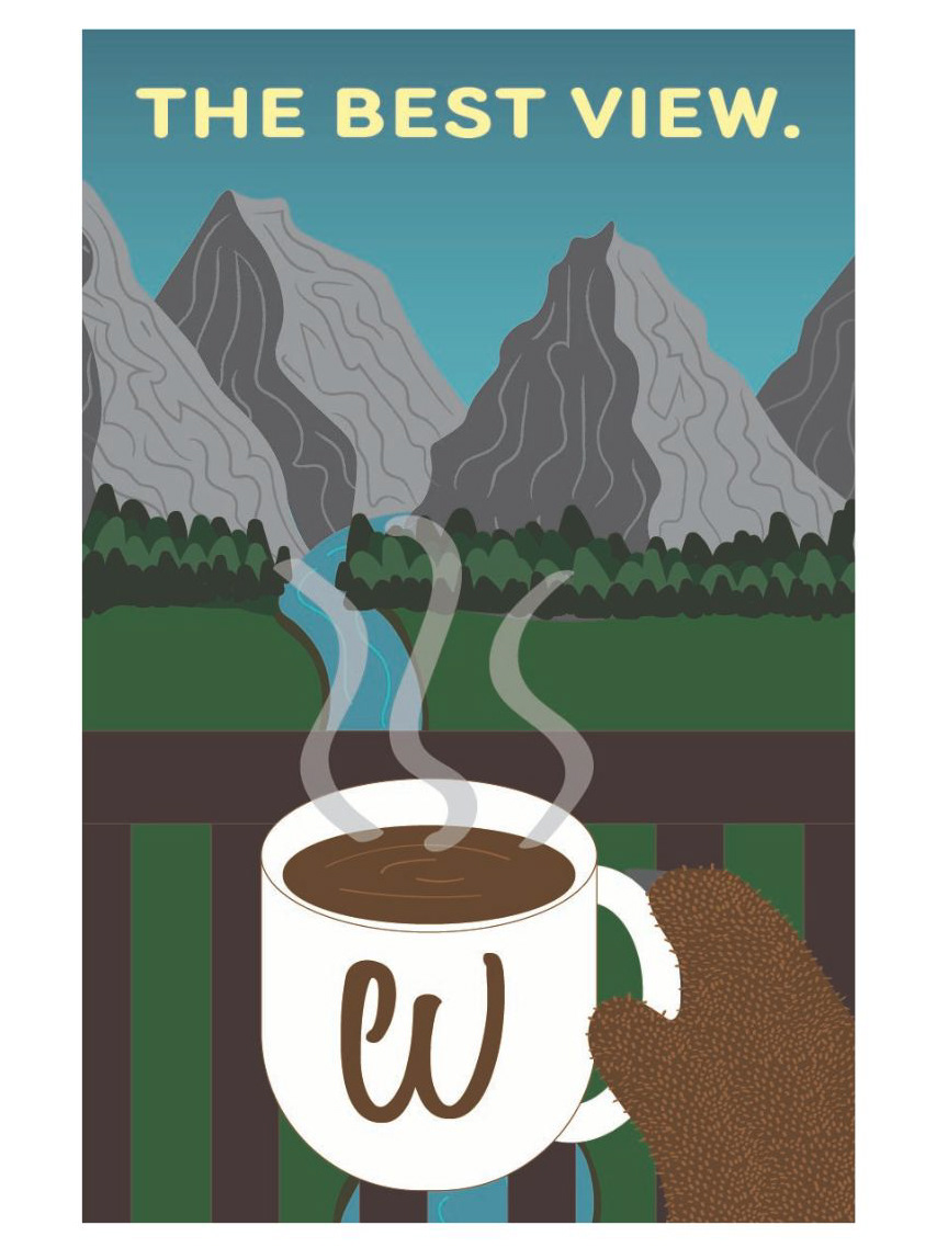
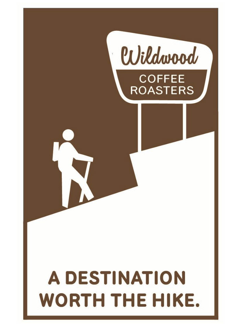
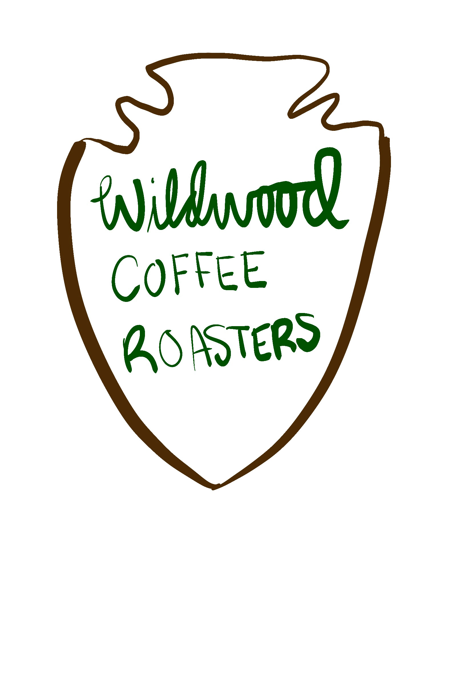
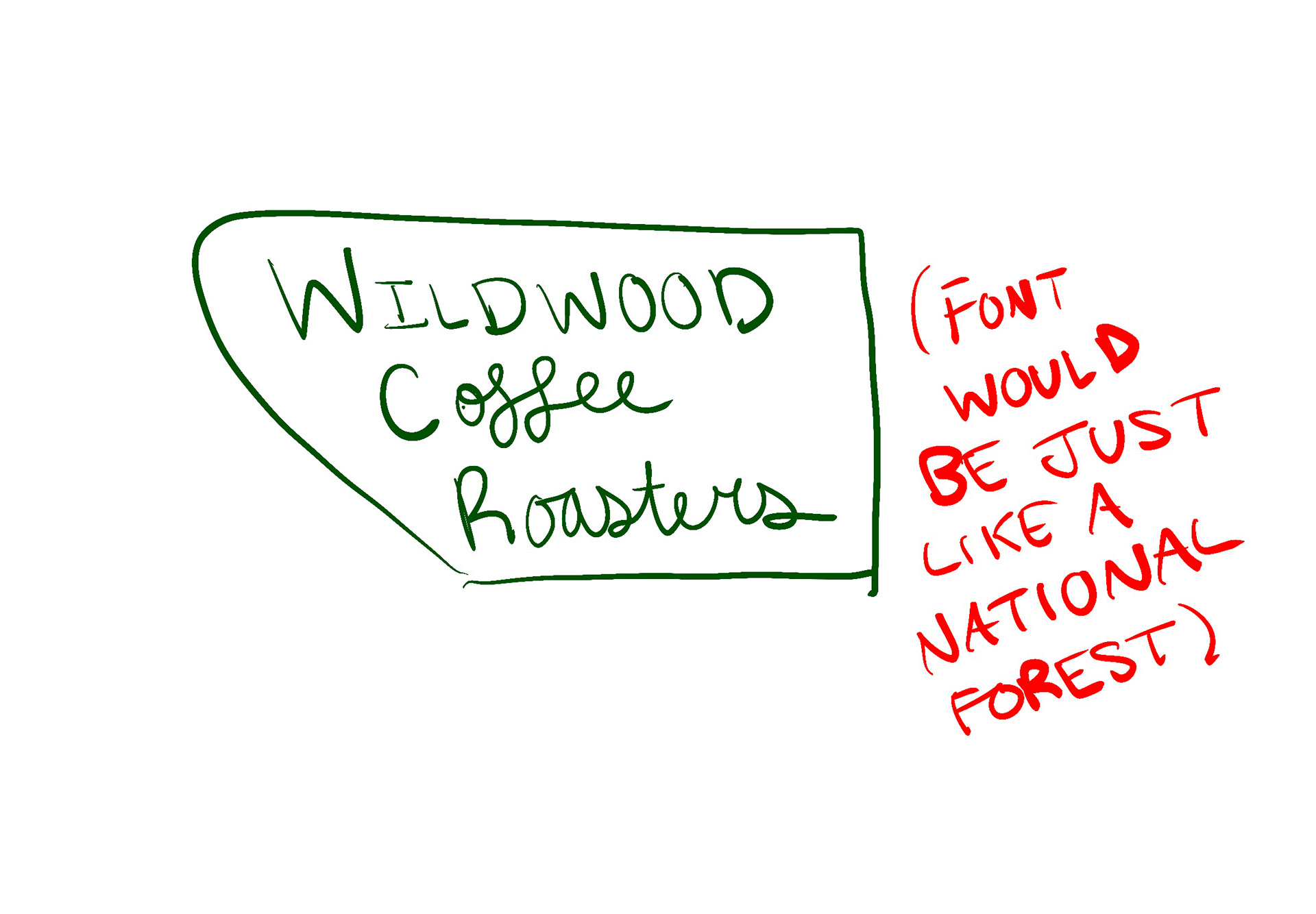
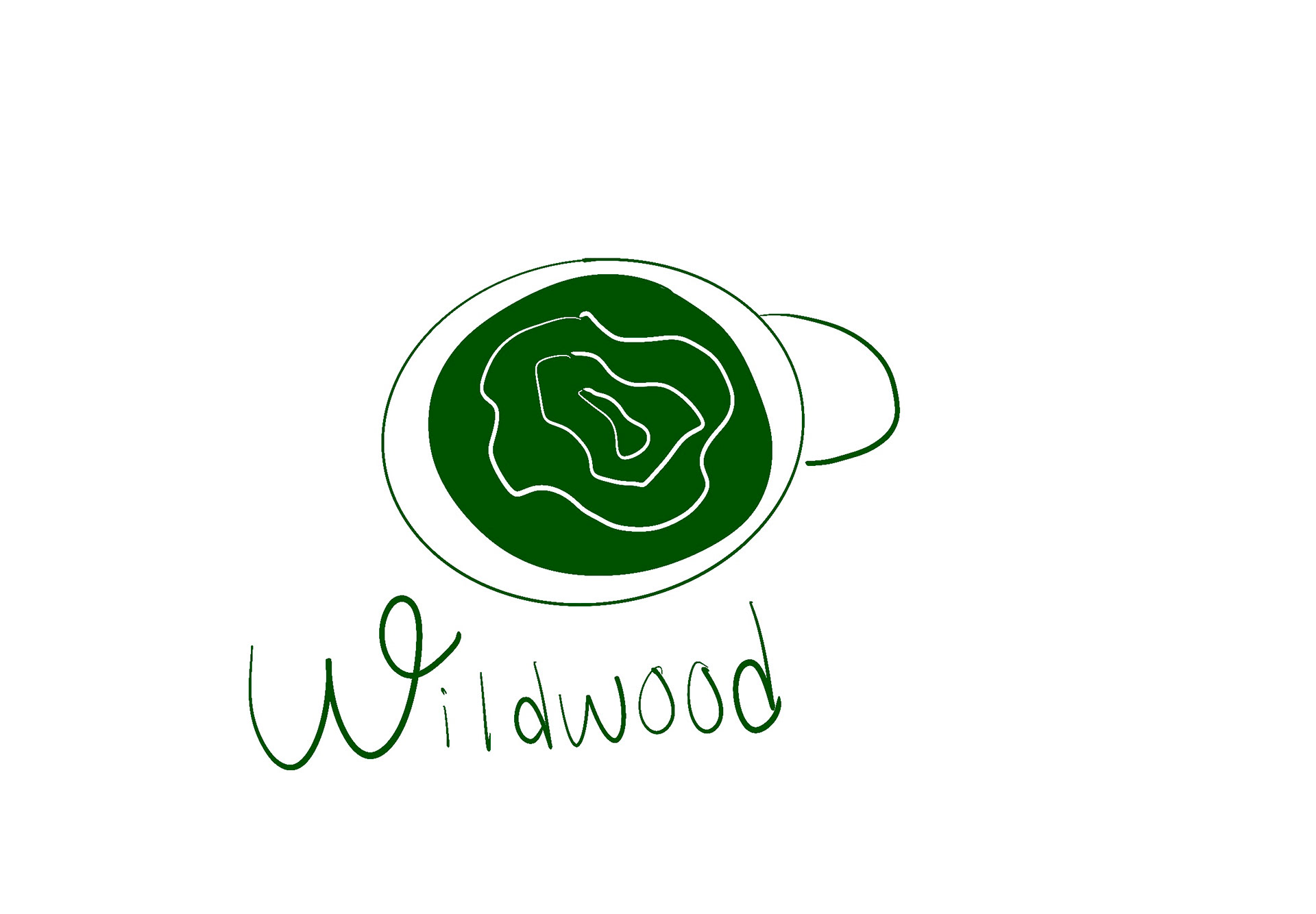
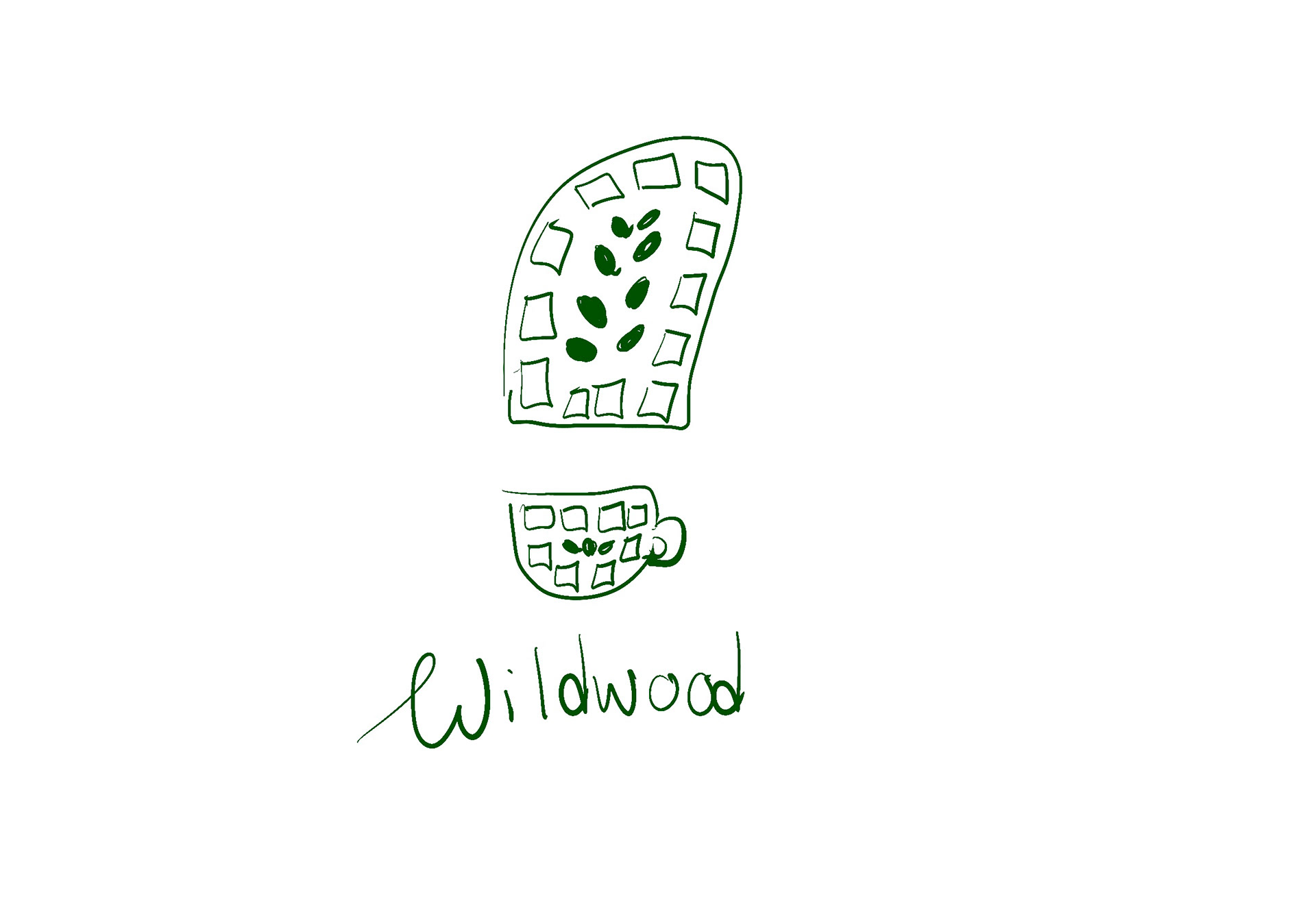
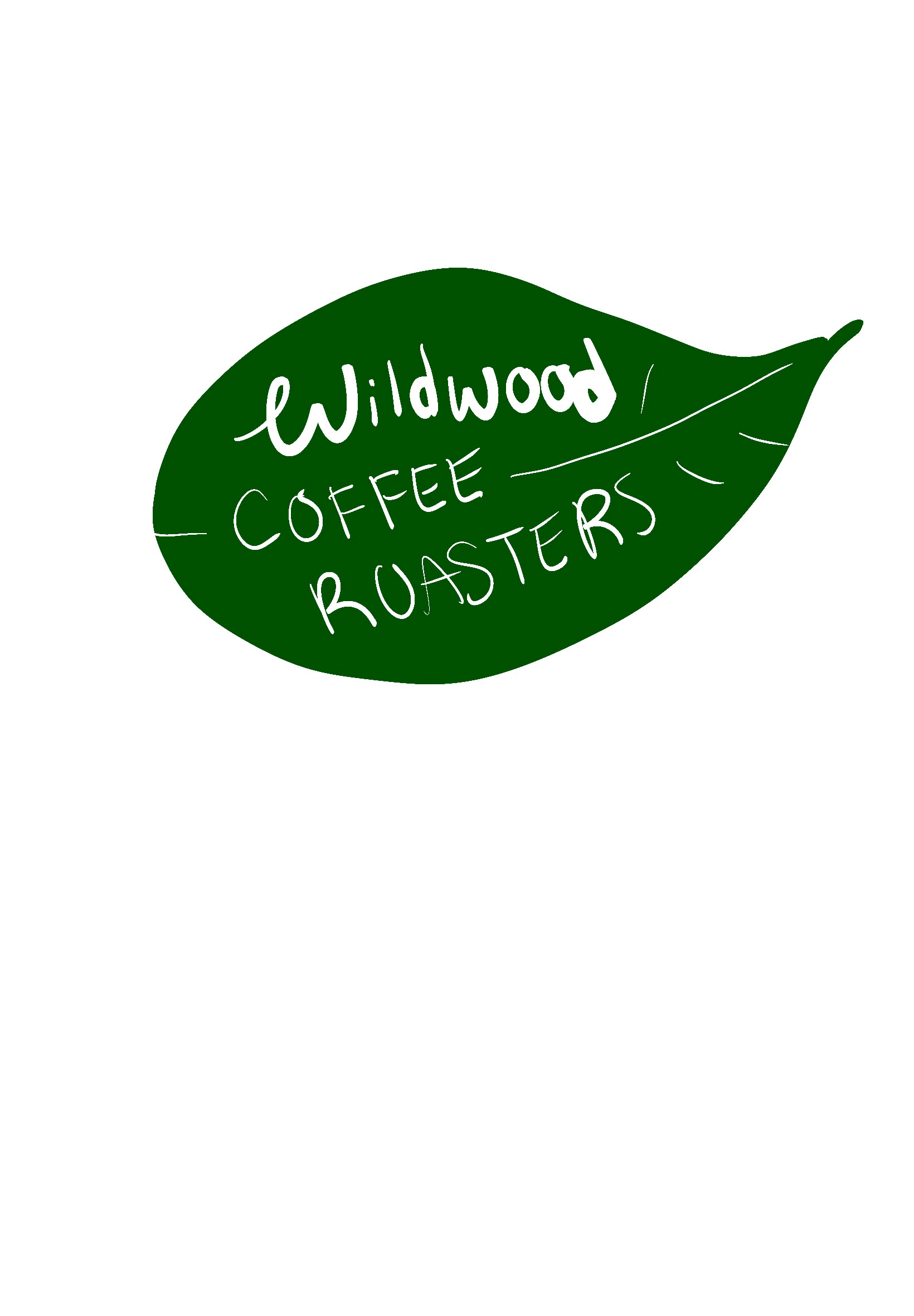
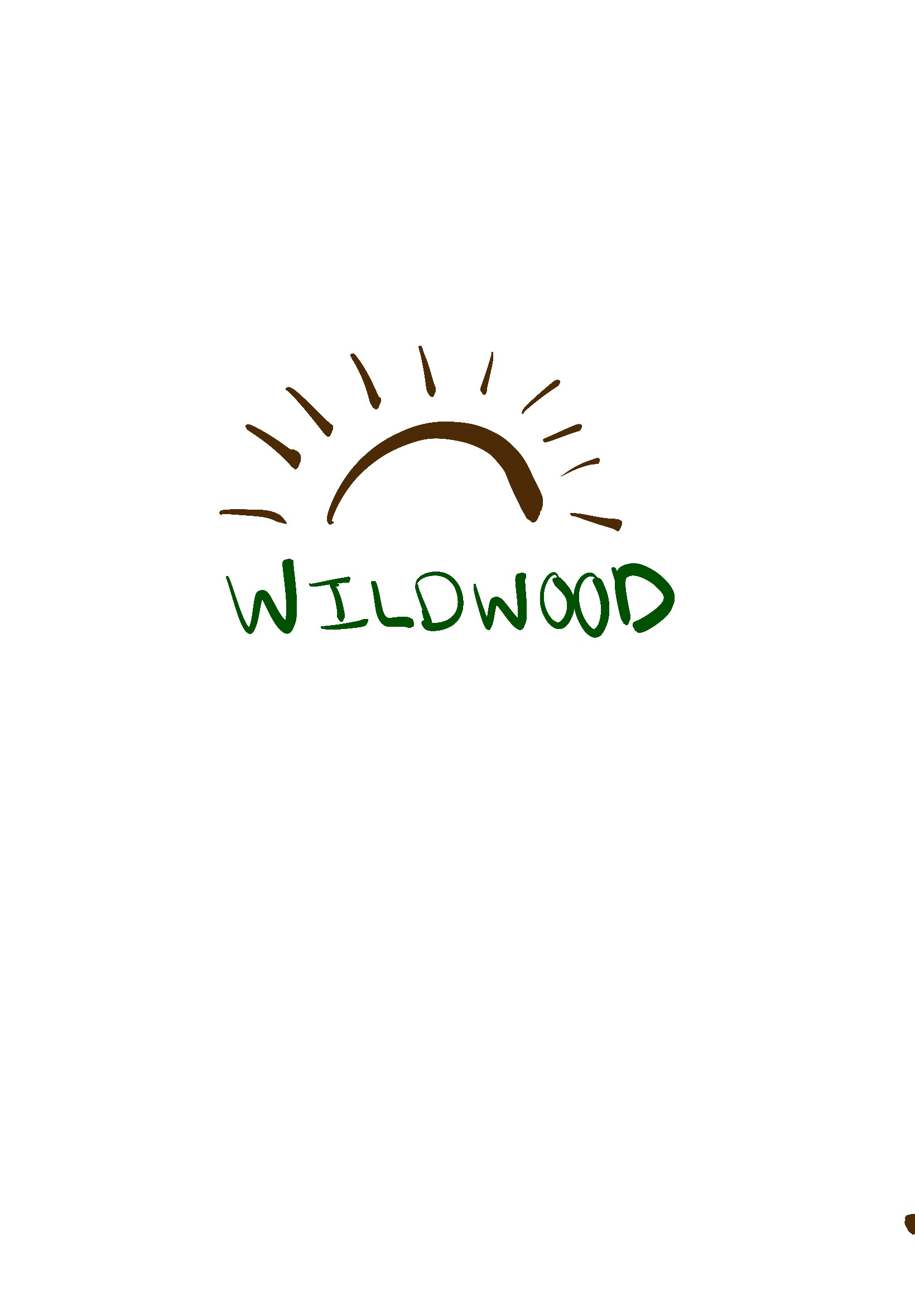
After sketching some ideas, I decided on three directions and decided to try each of them out, with different variations in size and color. My favorite of the three was the lantern and the national park sign. The following three images are my drafts.

FINAL DECISIONS:
After working with these drafts and getting crucial feedback from my peers and professor, I finally settled on the sign variation. It truly encompassed everything the brand was about and was my strongest direction. I loved the lantern so much, and my peers did too, so I decided to eventually refine it so that the company can use it for other branding designs.


REFLECTIONS:
The logo and branding project challenged me in many exciting ways. It helped me see areas to improve. I learned some new things on Illustrator that I’ve wanted to learn, including optimizing illustrated objects for scalability and installing fonts that fit the branding. Making a mood board was my favorite part of the planning process and proved extremely helpful. I could not have done this without the feedback of my peers and professor. I kept listening to their feedback where I felt was applicable. For example, my professor helped me learn sizing because he noticed it was off. It helped me make my design look cleaner and more professional. I chose this design because it speaks to a part of me that I love. I get very inspired when going to landmarks and national parks. It’s so simplistic and peaceful, and it also challenges you to take better care of nature. I felt like those things combined encompass the goals that Wildwood Coffee Roasters had. Their new logo and branding will now attract more customers to join in on the causes that are exciting to them. Overall, I feel more equipped for my graphic design career journey.

AI DISCLAIMER STATEMENT: For this assignment, I used ChatGPT. It created my imaginary brand profile and I borrowed the name and some of its brand goals. The tool also helped me in coming up with design directions. It gave me helpful feedback when I was stuck in certain design decisions or feeling like something wasn’t working. It was a very helpful tool in the design process, but it did not in any form create this logo.